Portra 160
View original postA versatile Portra-inspired negative look - works any time of day, and holds up in well-lit scenes at night.
- White Balance
- Shade A3 G3
From the creator
Chrizz's card gives Clarity two settings: 0, or -4 for the nostalgic look. This page carries the -4 nostalgic variant - set Clarity back to 0 for the cleaner rendering. Exposure he leaves entirely up to you.
Read the original postCamera compatibility
Originally created for the GR III - popular on the GR IV too. Every value dials straight in; the presets and settings are identical across bodies. The GR IV's newer sensor renders a touch warmer and brighter, so treat this as a starting point, not a guaranteed match; if it looks too warm, a small white-balance nudge toward blue brings it closer.
Straps, cases and filter adapters for your camera are on the gear page.
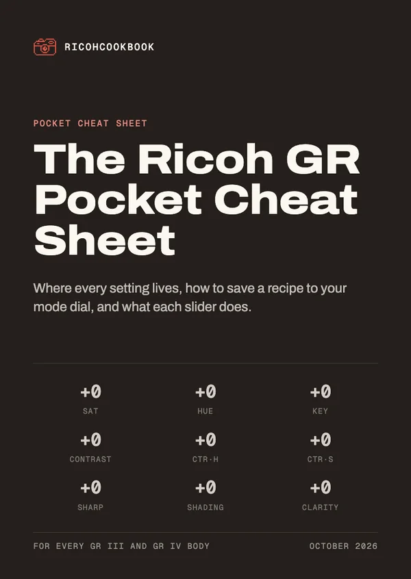
Get the GR Pocket Cheat Sheet
Pocket cards that explain every slider and walk you through saving a recipe on your camera. Sign up for the recipe emails and it's yours straight away.
Comes with the recipe emails: one when a recipe earns one. Unsubscribe anytime. Privacy